

Winning A/B tests are rarely just design wins.
They usually work because they change how shoppers feel about risk, clarity, urgency, and value.
That means the best tests are not always the prettiest ones. They are the ones that reduce hesitation and help the customer make a faster, more confident decision.
The strongest tests align with human behavior, not internal assumptions.
Why most A/B tests fail
Many teams test surface changes first:
- Button color
- Font size
- Small layout tweaks
- Decorative changes
Those changes can matter, but they often miss the real blocker.
If a shopper does not trust the offer, understand the value, or feel safe enough to buy, a visual refresh alone will not fix the problem.
The 4 psychological drivers behind winning tests
1. Trust and risk reduction
Shoppers need reasons to feel safe.
Trust cues include:
- Customer reviews
- Clear guarantees
- Shipping clarity
- Visible return policies
- Straightforward product explanations
These elements reduce the fear of making the wrong choice.
2. Cognitive ease
Simple experiences convert better than confusing ones.
When a page asks less effort from the shopper, the path to purchase feels easier.
That usually means:
- Cleaner copy
- Fewer choices
- More obvious hierarchy
- Stronger call-to-action contrast
3. Urgency and loss aversion
People react strongly to the possibility of missing out.
That is why:
- Limited-time offers work
- Low-stock messages work
- Deadline-based promotions work
The fear of losing a good deal often motivates action more than the hope of gaining a better one later.
4. Value framing
The same price can feel expensive or reasonable depending on how it is presented.
A strong test can change the frame by showing:
- What is included
- Why the price is fair
- What problem the product solves
- How the customer saves time or money
Psychology vs design
A new design can make a page look more modern.
A psychology-backed test makes the page easier to buy from.
| Test type | What it changes | Likely impact |
|---|---|---|
| Design-only test | Visual style and layout | Sometimes useful, often limited |
| Psychology-focused test | Trust, clarity, urgency, value | Usually stronger conversion lift |
The difference is that psychology targets the decision itself, not just the container around it.
Example: trust messaging vs a redesign
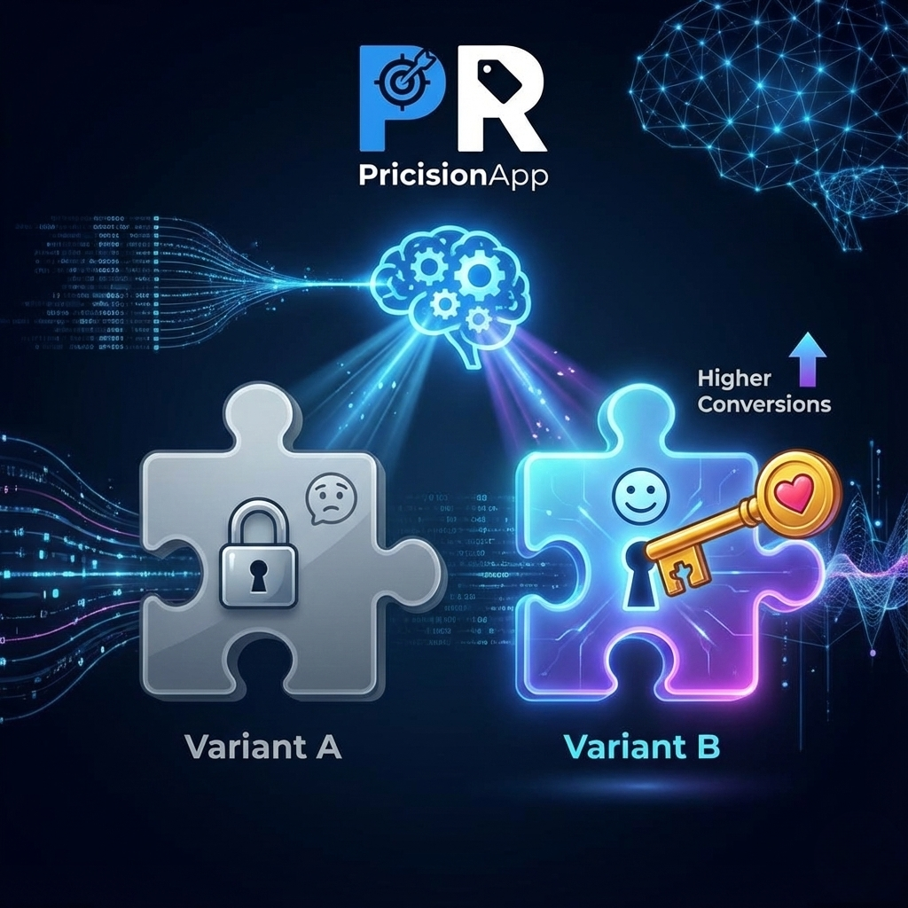
Imagine a Shopify brand testing two versions of the same product page.
- Version A: a redesigned page with better spacing and updated visuals
- Version B: the original page with stronger trust messaging, clearer benefits, and simplified copy
In many cases, Version B wins.
Why?
Because the buyer did not need a prettier page.
They needed a page that answered objections faster.
How to build better A/B tests
Use this process when planning an experiment:
- Identify the real friction point.
- Choose one psychological driver to test.
- Change only one major variable.
- Measure conversion, revenue, and profit per visitor.
- Keep the winning version as your new baseline.
Good test ideas often come from customer questions and objections:
- Do shoppers trust the product?
- Is the offer easy to understand?
- Does the price feel justified?
- Is there enough urgency to act now?
Common mistakes
The most common mistake is testing what is easy instead of what matters.
Other problems include:
- Changing too many things at once
- Ignoring customer objections
- Using vanity metrics instead of profit
- Assuming one win means the whole page is solved
A test only becomes useful when it teaches you something real about customer behavior.
Final takeaway
The best A/B tests do more than improve a page.
They improve the customer’s decision-making experience.
If you test trust, clarity, urgency, and perceived value, you are more likely to find changes that actually move conversion.
Pricision
Stop guessing your next price
Use real customer behavior to discover the price that generates the strongest result for your Shopify store.
Start your free trial