

Most shoppers do not say no right away.
They pause.
They scroll.
They compare tabs.
They tell themselves they will come back later.
That hesitation is where conversions are won or lost.
The difference between a browser and a buyer is often not a dramatic redesign. It is a series of small cues that make the next step feel obvious, safe, and worth it.
The best “Buy Now” button does not force a decision. It makes saying yes feel easier than waiting.
Why shoppers hesitate in the first place
Window shoppers are usually not rejecting the product.
They are reacting to friction.
That friction often sounds like this in the shopper’s head:
- Is this really worth the price?
- Can I trust this store?
- What if I find something better in five minutes?
- What happens if it does not fit, work, or arrive on time?
- Do I need this now, or can I wait?
Your product page has to answer those questions fast.
If it does not, hesitation wins.
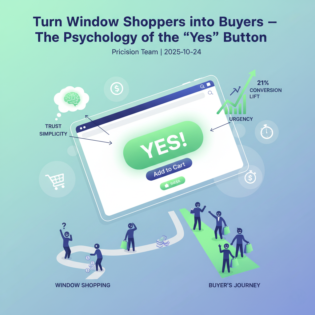
The psychology of the “Yes” button
The button matters, but not in the shallow way most teams think.
It is not just about color.
It is about everything around the button that shapes the decision before the click happens.
| Cue | What the shopper feels | Conversion effect |
|---|---|---|
| Clear value framing | “This seems worth it” | Reduces price resistance |
| Trust signals | “This feels safe” | Lowers perceived risk |
| Specific CTA copy | “I know what happens next” | Increases confidence |
| Urgency | “I should not wait too long” | Reduces procrastination |
| Simplicity | “This is easy” | Lowers cognitive load |
When those cues line up, the call to action becomes more than a button.
It becomes the natural next step.
1. Make the value feel immediate
Shoppers rarely buy because a page is informative.
They buy because the benefit feels clear enough, fast enough.
That means your product page should answer one core question above the fold:
Why should this shopper care right now?
Strong value cues often include:
- A headline that focuses on the result, not just the product name
- Short benefit-led copy near the CTA
- A price explanation when the offer needs context
- Visual proof that the product solves a real problem
Weak vs stronger value framing
| Weak copy | Stronger copy |
|---|---|
| Premium skin serum | Smoother, brighter skin in minutes a day |
| Ergonomic office chair | All-day support for long work sessions |
| Meal container set | Prep a full week of lunches without the mess |
The second version gives the shopper a reason to act.
2. Reduce fear before asking for the click
Many conversion issues are trust issues in disguise.
If the shopper senses even a little risk, the safer option is to delay the purchase.
Place trust builders close to the decision point, such as:
- Review count and rating
- Delivery timing
- Free returns or guarantee language
- Secure checkout messaging
- Clear payment options
A CTA gets stronger when it is surrounded by proof, not pressure.
Trust is especially important on mobile, where attention is short and shoppers make faster decisions with less context on screen.
3. Use CTA copy that completes the thought
Generic buttons like Submit or Continue create distance.
Specific buttons reduce ambiguity.
Instead of treating the CTA as a label, treat it as the final line in your sales argument.
Examples:
- Add to Cart when the next step is straightforward
- Get My Discount when the shopper is responding to an offer
- Start My Free Trial when commitment feels risky
- Reserve Yours Today when scarcity is part of the offer
The right CTA copy depends on the buying context, but the rule is simple: make the action feel concrete and beneficial.
4. Frame price so it feels easier to accept
Price is one of the biggest “maybe later” triggers.
The solution is not always to lower it.
Often, the better move is to frame it more effectively.
Here are a few conversion-friendly pricing cues Shopify brands can test:
| Pricing cue | Example | Why it can work |
|---|---|---|
| Anchoring | Show a higher compare-at price | Makes the current offer feel more reasonable |
| Per-unit framing | “Only $1.20 per serving” | Shrinks perceived cost |
| Bundle framing | “Buy 2, save 15%” | Increases value perception |
| Threshold incentive | “Free shipping over $60” | Encourages action and AOV |
The key is to make the price easier to justify, not easier to doubt.
5. Remove tiny points of friction
Shoppers do not always abandon because of one big issue.
Sometimes they leave because the page asks for too much effort.
Common friction points include:
- Long blocks of copy near the CTA
- Too many variant options at once
- Hidden shipping information
- Competing buttons and links
- Weak visual hierarchy on mobile
If the shopper has to stop and decode the page, momentum drops.
That is why high-converting pages often feel simpler than expected.
A practical checklist for turning more “maybes” into “yes”
Review your product page and ask:
- Is the primary benefit obvious in the first few seconds?
- Does the CTA explain the next step clearly?
- Are trust signals visible near the purchase action?
- Does the price feel justified, framed, and easy to compare?
- Is there a reason to act now instead of later?
- Can a mobile shopper understand the offer without extra effort?
If several of those answers are no, the problem is likely not traffic.
It is hesitation inside the buying experience.
What to test first on Shopify
If you want quick wins, start with experiments that change decision quality, not just aesthetics.
Test ideas:
- CTA copy: Add to Cart vs Get Yours Today
- Price framing: standard price vs compare-at anchor
- Trust stack: reviews alone vs reviews + guarantee + shipping clarity
- Offer structure: single-unit price vs bundle savings message
- Above-the-fold copy: product description vs outcome-focused promise
These tests tend to reveal more than visual-only tweaks because they target the shopper’s internal objections.
Common mistake: optimizing the button instead of the decision
Brands often obsess over:
- Button color
- Corner radius
- Animation
- Micro-layout changes
Those details can help, but only after the page answers the deeper questions of value, trust, urgency, and clarity.
If the offer feels uncertain, a prettier button will not fix it.
Final takeaway
The psychology of the “Yes” button is really the psychology of confidence.
When your Shopify store makes the offer feel clear, safe, valuable, and easy to act on, more window shoppers turn into buyers.
The goal is not to push harder.
It is to remove the reasons people hesitate.
Pricision
Stop guessing your next price
Use real customer behavior to discover the price that generates the strongest result for your Shopify store.
Start your free trial